The Challenge
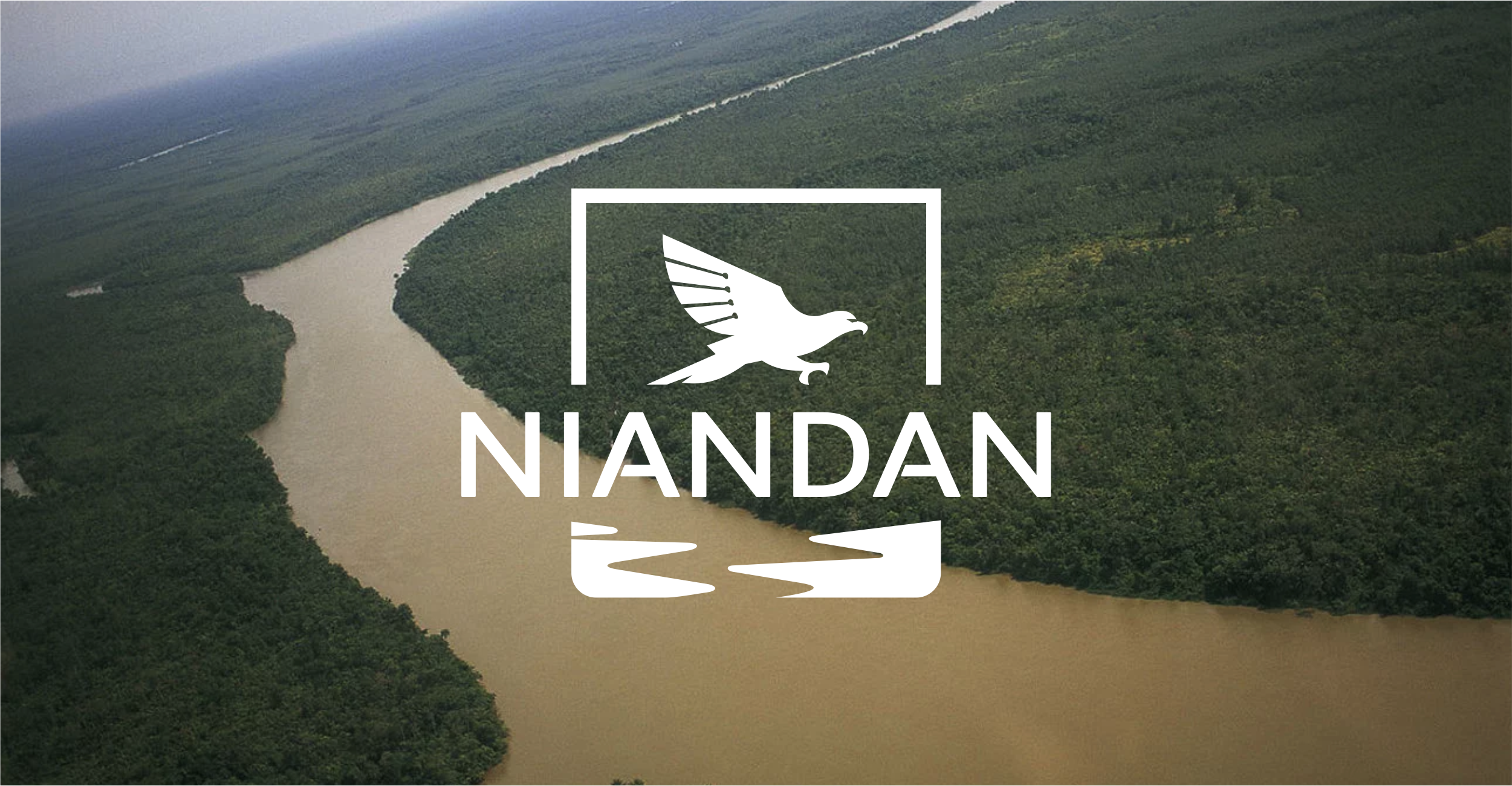
Niandan takes its name from the Niandan River, a tributary of the River Niger near Kissidougou in Guinea. Like the river, which originates in Guinea’s highlands, Niandan symbolizes the region’s untapped potential and resilience. At Niandan, our team is our greatest asset. Founded with the belief that Guinea and other frontier markets in West Africa have an outsized role to play in the region’s economic growth, Niandan is dedicated to empowering local businesses and entrepreneurs. Our mission is to leverage best-in-class talent and international partnerships to support and scale enterprises that drive sustainable development.
The Solution
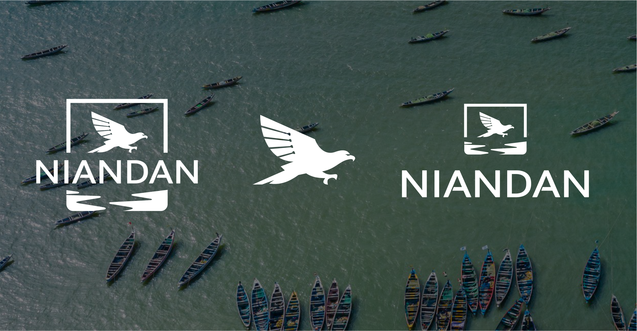
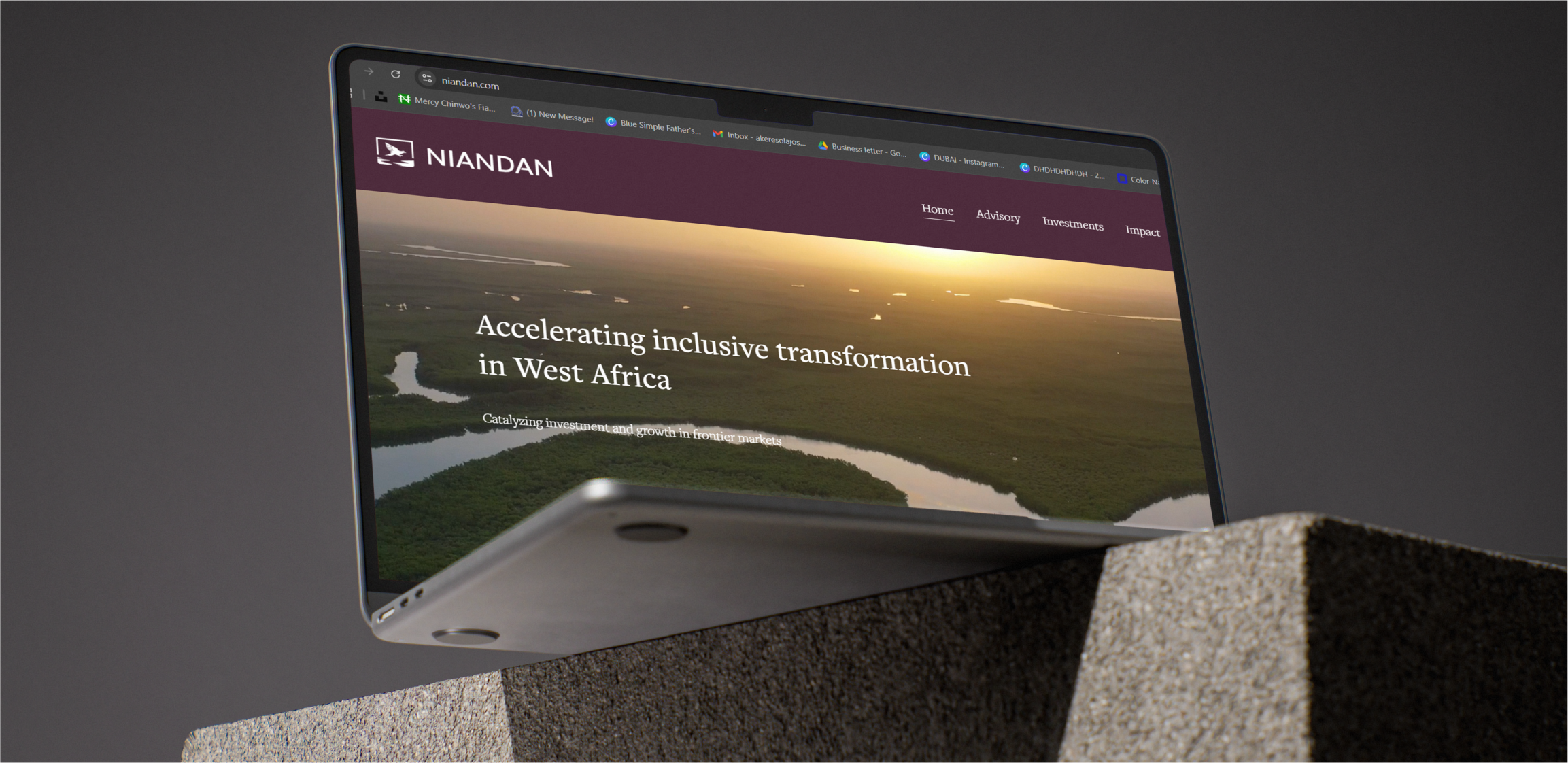
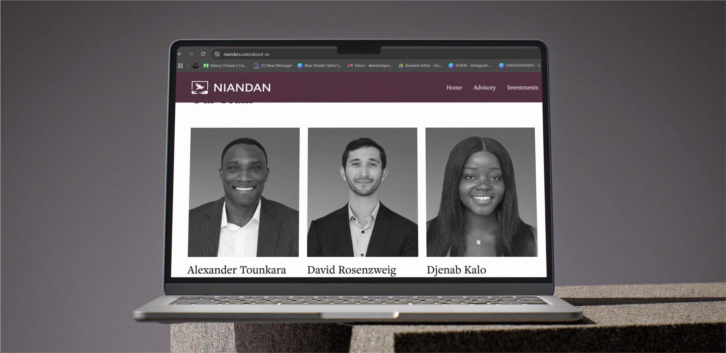
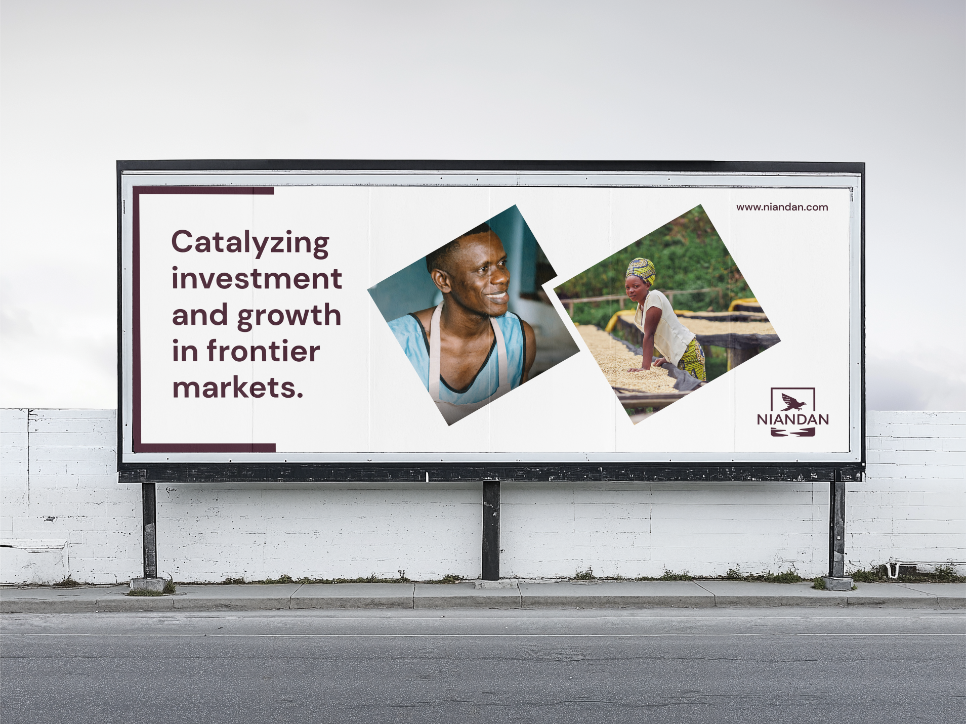
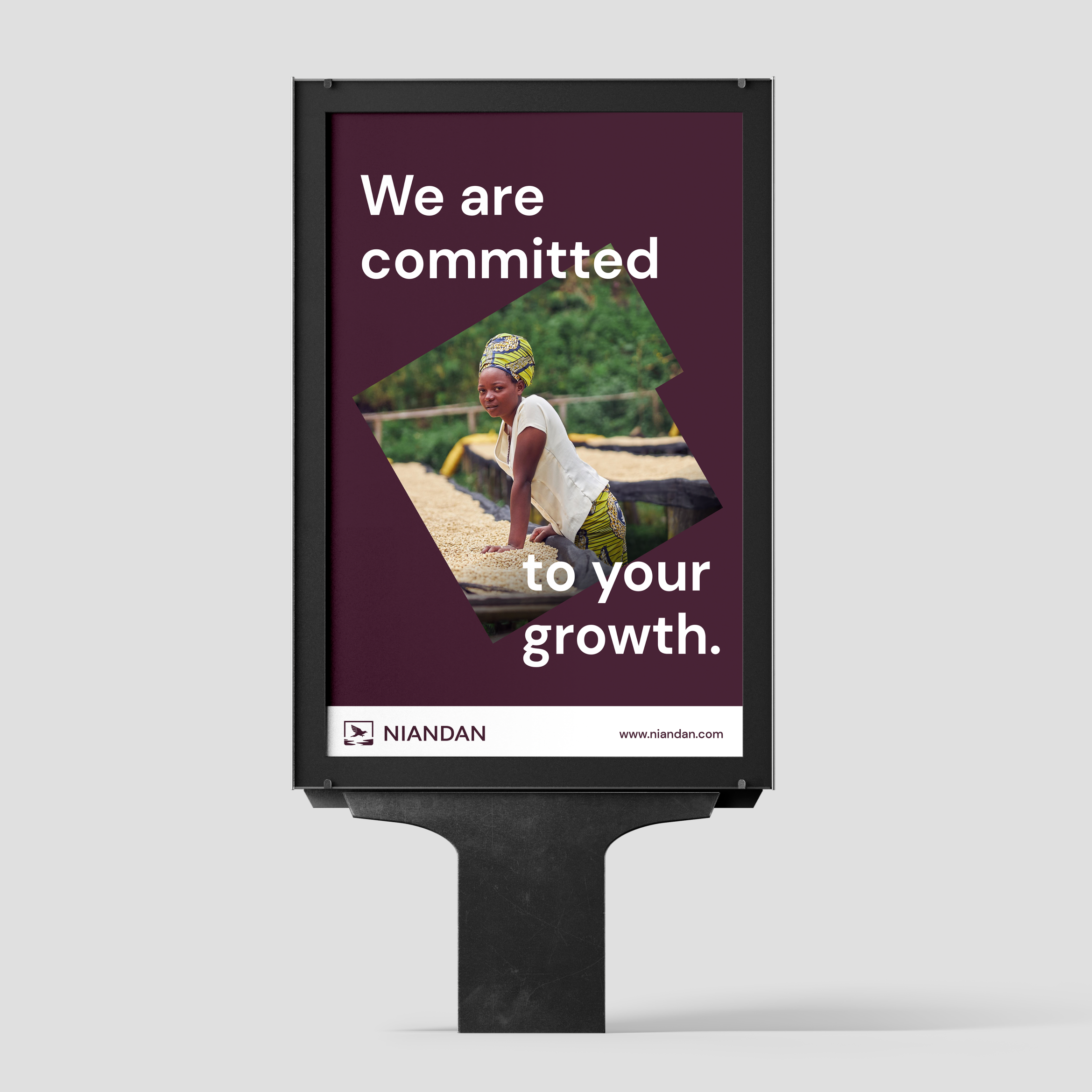
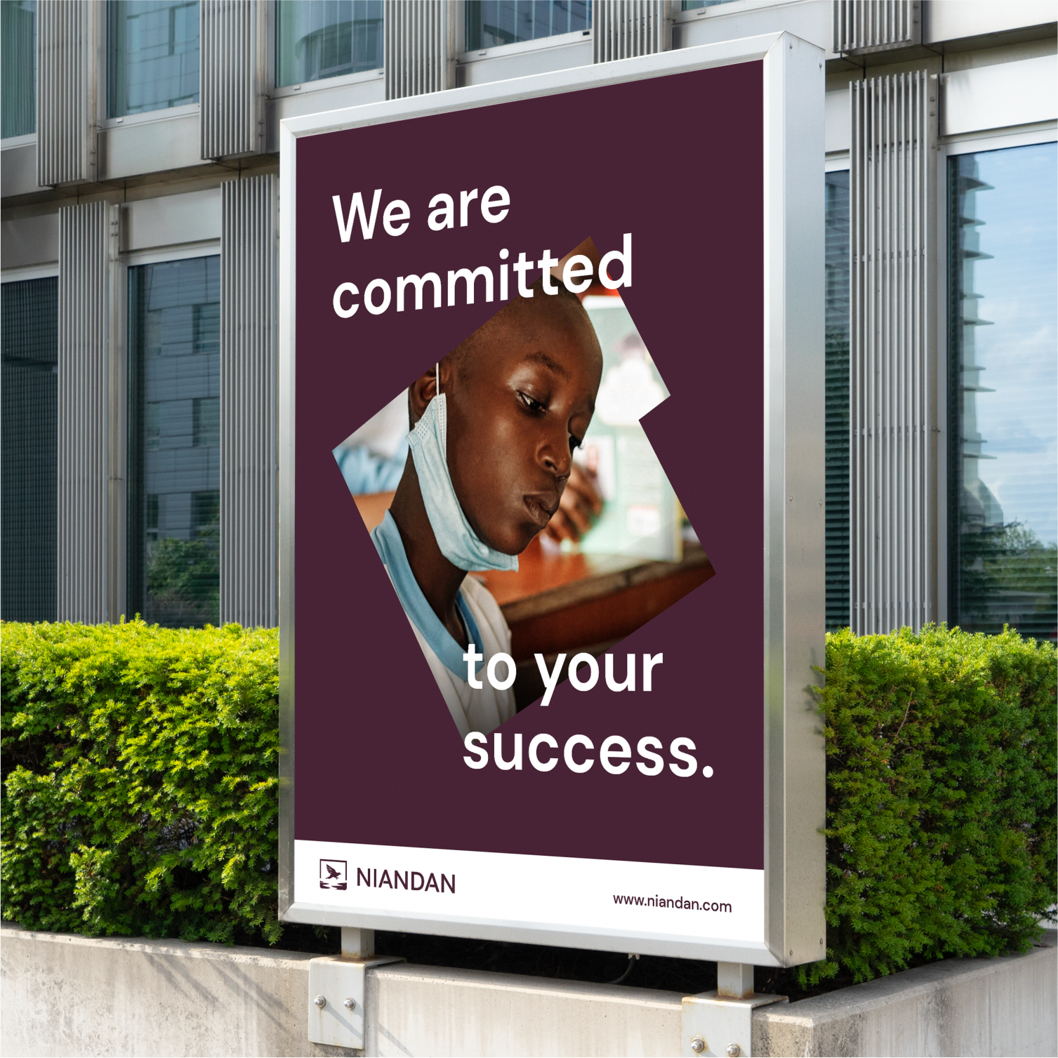
Niandan’s old identity didn’t show what the brand truly stood for. It was missing the clarity and professionalism needed to earn trust from global investors, and it didn’t reflect the rich culture at the heart of its mission in West Africa. As the company grew, it became clear that the brand needed a new direction.The rebrand was about creating a fresh identity that told a stronger story. "We wanted something that felt modern and professional, but still warm and connected to Niandan’s roots". Every part of the process was thoughtful and intentional. From the strategy to the visual design, i focused on building an identity that works everywhere on digital platforms, printed materials, and investor presentations. The result is a brand that is simple, strong, and flexible. It shows who Niandan is: a trusted partner for investors and a positive force for communities.
Scope of Work
Visual Identity
Brand Guidelines
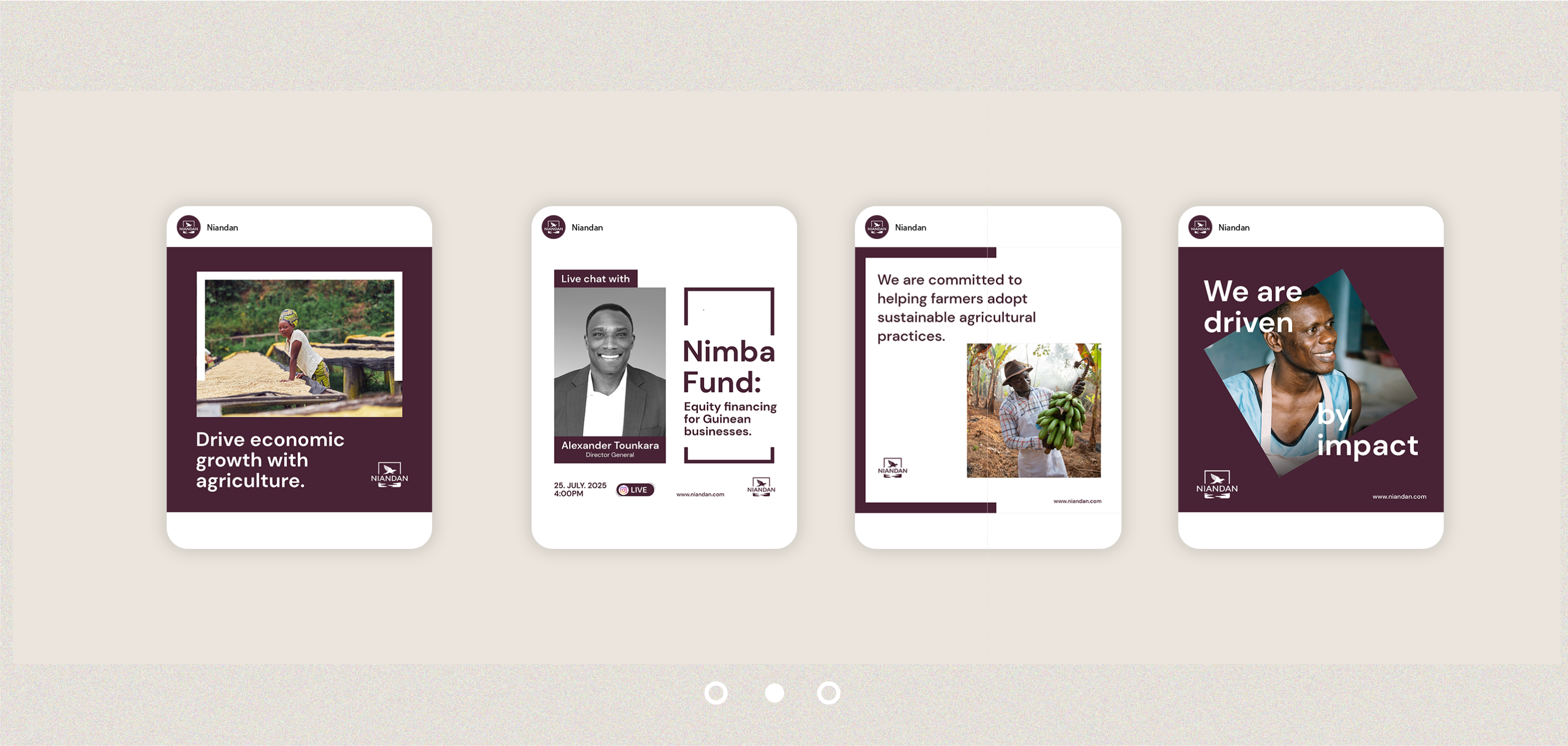
Digital Assets
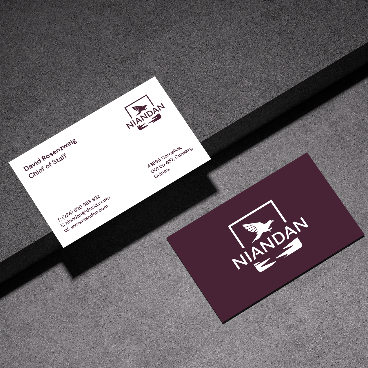
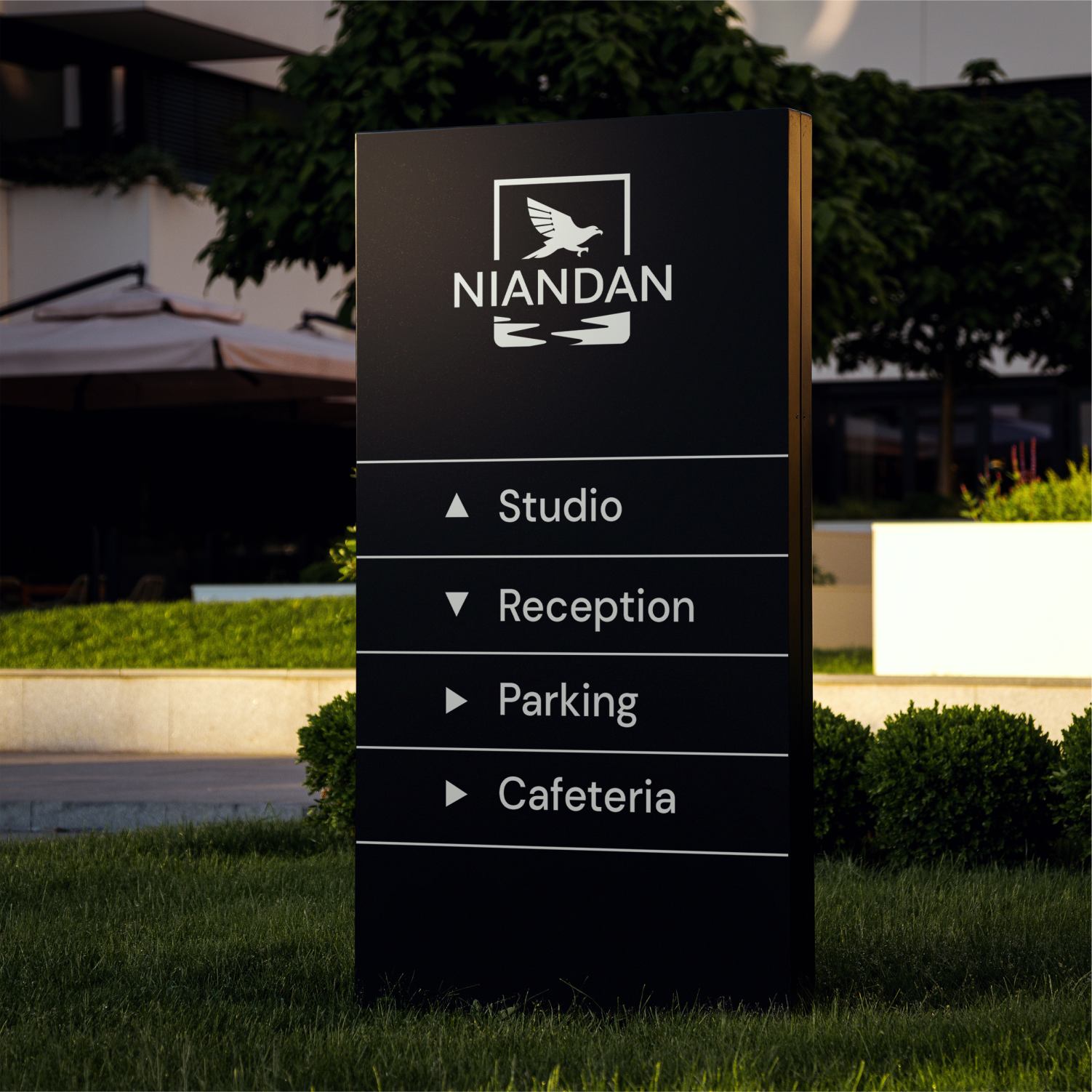
Prints
Presentation deck
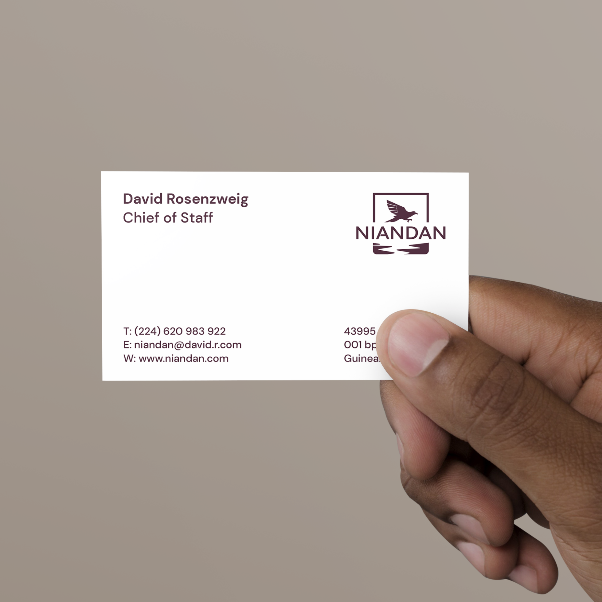
Stationary
Niandan 2024
www.niandan.com